A Complete Guide To Using Fonts In Your CV
The right fonts can enhance readability, convey professionalism, and showcase your personality, while the wrong ones can unintentionally diminish the effectiveness of your CV.
The font is probably one of the last things that comes to your mind while crafting your resume. However, typography plays a vital role in shaping the overall presentation and impact of your resume. The right fonts can enhance readability, convey professionalism, and showcase your personality, while the wrong ones can unintentionally diminish the effectiveness of your CV.
What is the best font for your CV?
Whether you're a job seeker looking for a better opportunity, a student preparing for internships, or a seasoned professional considering a career change, mastering the art of font selection will help you improve appeal, readability, and professionalism.
Let's discuss the following in today’s blog “A Complete Guide To Using Fonts In Your CV ”:
- Importance of choosing the right font for your CV
- Choosing the right or best font for your CV
- The most used fonts in CVs
- 3 things to remember while crafting your CV
- 20+ CV examples on Resumod
By the end of this guide, you'll possess the knowledge and confidence to strategically leverage fonts to leave a lasting impression, compelling employers to take notice of your qualifications and expertise.
Importance of Choosing the Right Font for Your CV
When you only have 7 seconds to get shortlisted, every tiny detail counts including the font you chose. Here's how the right font helps you:
Improves readability
A well-chosen font will make your CV easier to read, ensuring that recruiters can easily navigate it and find the information they need. Using fonts that are difficult to read can cause confusion or confusion, and cause your CV to be overlooked.
Add to professionalism
A simple and neat presentation is a mark of professionalism. A font goes a long way in making your resume appear neat. A font that is too decorative or playful can make you appear unprofessional, while a simple and conventional font can deliver a more polished impression.
Maintain Consistency
Using a single font in the course of your CV creates a cohesive and organized appearance. Inconsistencies in font show a lack of detail and confusion.
Builds Personal Branding
The font you use also can make a contribution to your non-public branding. For example, a creative area might also gain from an extra unique or playful font, while a traditional field can also require a more conservative font. The font you pick must align with your nonpublic emblem and the industry you are applying to.
Helps with Attention-Grabbing
While only the font selection may not get you through the process, it can assist make your CV stand out in a pile of other resumes. A properly-selected font can capture the recruiter's interest and make your CV more recallable.
Choosing the Best Font for your CV
Like colour, font too contributes to how we perceive documents. While selecting the font, think about how you want your reader to feel. For instance, a simple font will make the reader calm, as they will be able to skim through it.
Font Style: Keep It Simple
We follow what Aristotle said years ago- "Simplicity is the greatest form of Sophistication". Using a simple font, which is easy to read is always the best choice. Simple fonts do not distract the reader while making your resume look polished,
Font Size: Use Legible Length
Not just the style, but the size of the font matters too.
An extra small or extra large font size will make the resume unreadable. A font length of 10-12pt is a safe choice for resume writing. Whatever font size you chose, ensure it is easy on the eye and keeps your resume look put together.
Industry-Specific Considerations
Depending on the industry you are applying to, there can be particular fonts that might be preferred or expected. For instance, the “Tsuki Typeface” which is a pixelated font and widely used in games, might look more interesting for a gaming designer profile. The same font might not work in the finance industry

Use Bold And Italics Sparingly
Bold and italicized text may be beneficial for highlighting essential information or creating a hierarchy inside your report. Using bold and italics frequently in the resume will make them lose their purpose and rather make your resume cluttered.
Avoid Decorative Fonts
Decorative fonts or cursive affect the professionalism of the CV. It distracts the recruiters from the actual content and also makes it hard to navigate. However, it might be really helpful, if you are applying for a “Event Planner” profile.
Be Consistent
Whatever font you pick out, make sure to use it continually during your record. This creates a cohesive and polished look.
Your choice of the best font for a CV and a cover letter should be the same. Make sure you have matching CV and cover letter templates for a cohesive look.
The Most Used Fonts in CVs
Choosing a classic font that is accepted by all OS is always a great choice. Fonts like Times New Roman, Arial, and Calibri are top-notch options for a neat and professional look.
Here are some professional classic fonts options that are used widely:
- Times New Roman: This font is widely used in professional documents. It is clear and easy to read and is a safe choice for most industries.
- Arial: Arial is a neat font option to be used in a CV. Reflecting as an example of modern appearing font this is the best for easy readability.
- Calibri: Calibri is a popular font that is easy to read in any standard font size. It has a clean, simple look and is a must-apply choice for creative industries.
- Garamond: Garamond is a serif font. It is the best bet for a clear and graceful appearance. This is one of the preferred fonts in traditional industries.
- Georgia: Georgia is the perfect elegant font available. It is a serif font and is mostly a smart pick in many traditional industries.
3 Things to Remember While Choosing the Best Font for your CV
Even after getting everything right, your resume might look cluttered and unappealing. There are mistakes that you make out of unawareness. Note the following things while you work on your resume to make it look as fresh and clean as ever:
- Avoid the use of all caps: All caps may seem a good option for emphasizing a text but it may give a shouting and rude impression. Instead, use bold or italicized text to highlight vital statistics. You can also alternate between two colors.
- Refrain from trend-hopping: A trendy font that you see doing rounds on social media is often not a great choice for your resume. Even if it does make an impact, it will be short-lived, just like the trend.
- Avoid highlighting: A notebook is a great place to highlight, not a resume. Try other styles of formatting to make the important points in your resume stand out.
20+ CV Examples on Resumod
Resume of Wind Engineer
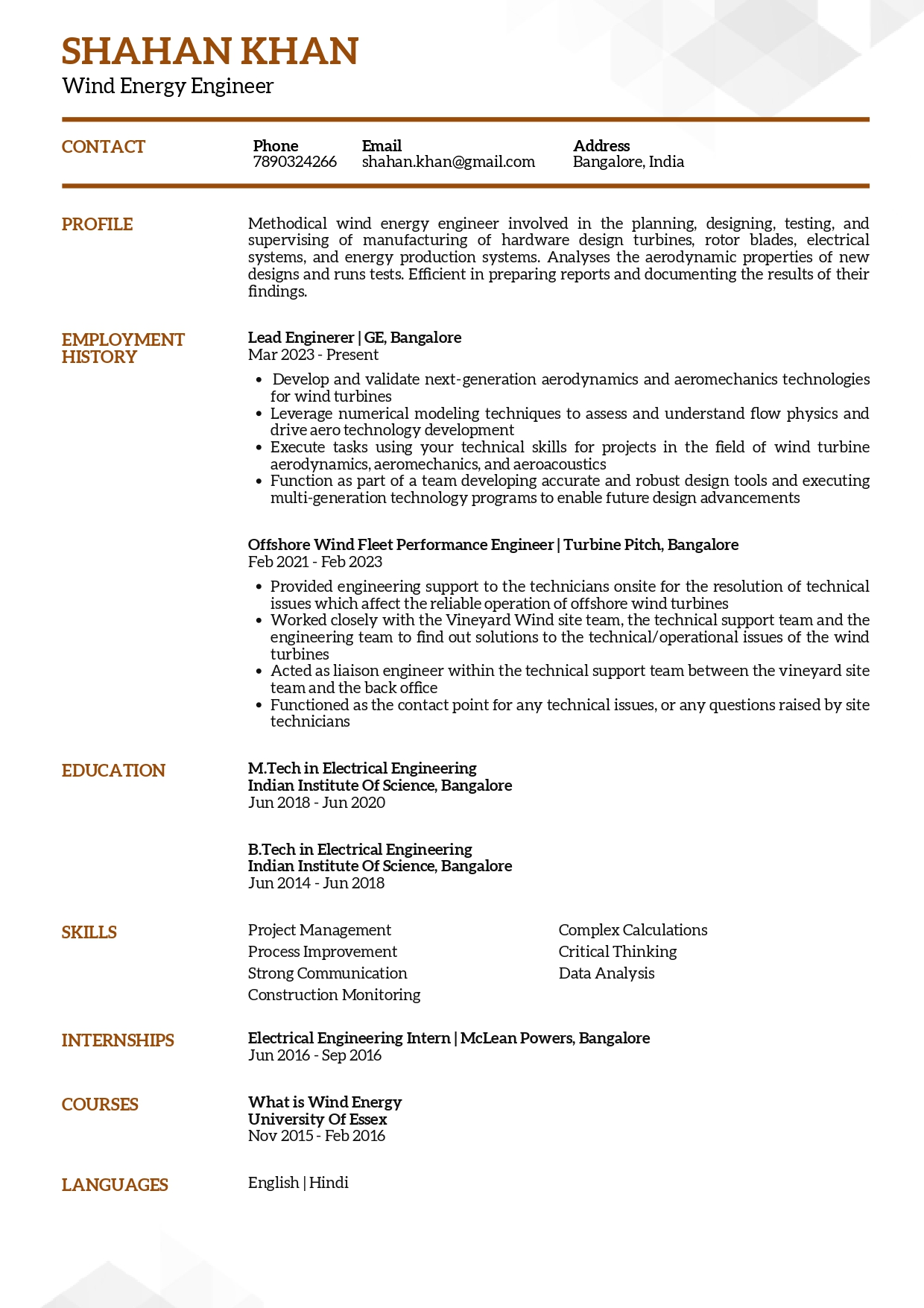
Check the full resume of wind engineer in text format here
Resume of HR Assistant
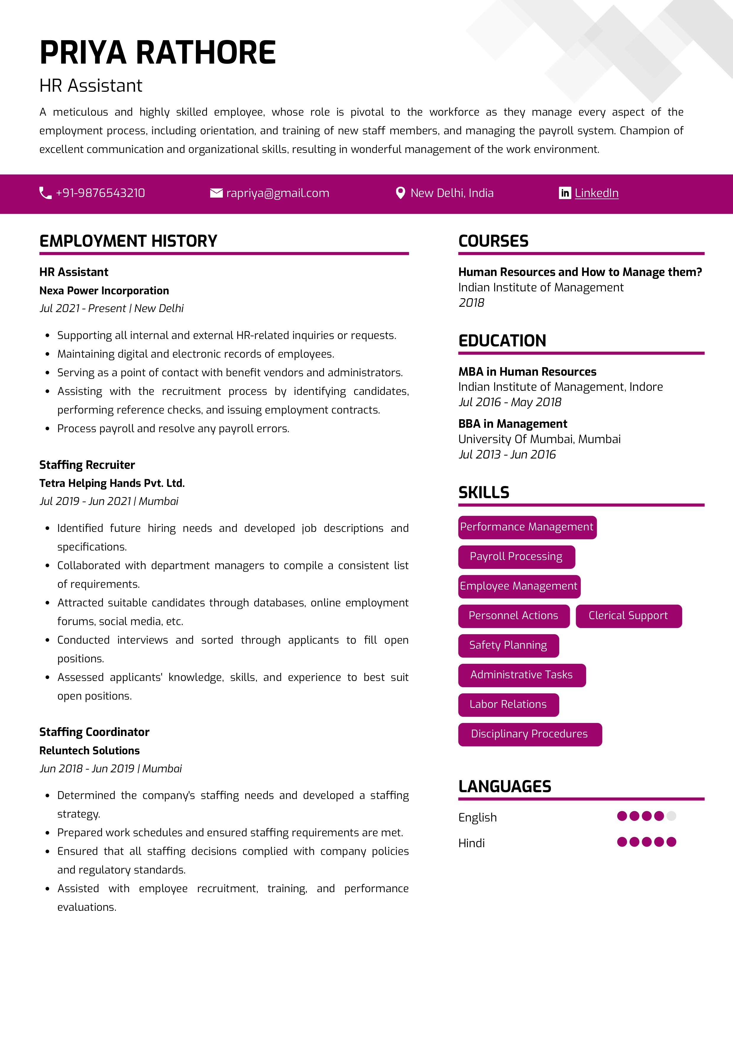
Check the full resume of HR assistant in text format here
Resume of Solid Waste Technician
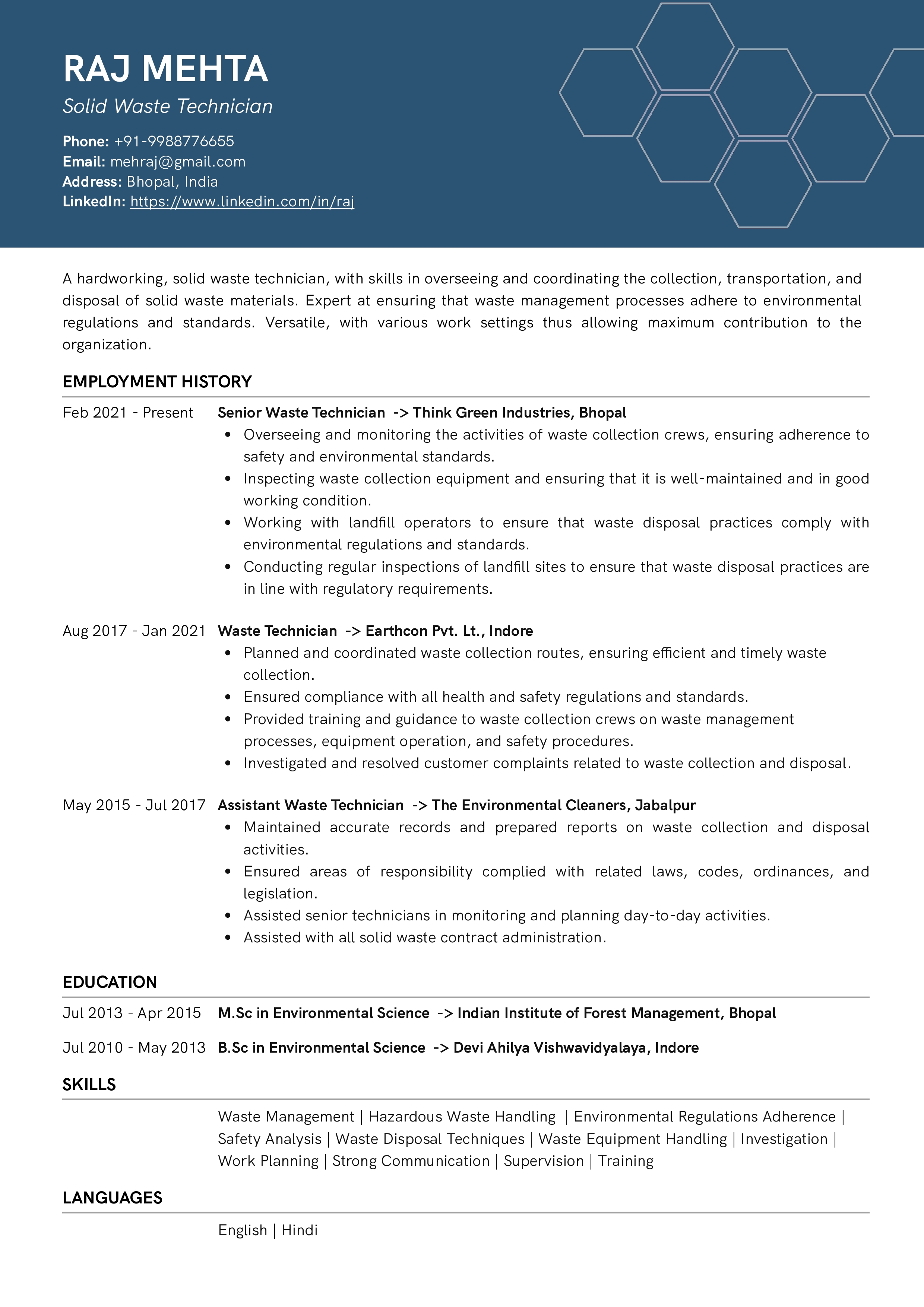
Check the full resume solid waste technician in text format here
Resume of Vendor Manager
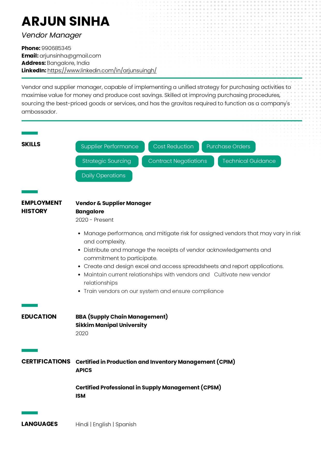
Check the full resume of vendor manager in text format here
Resume of Growth Product Manager
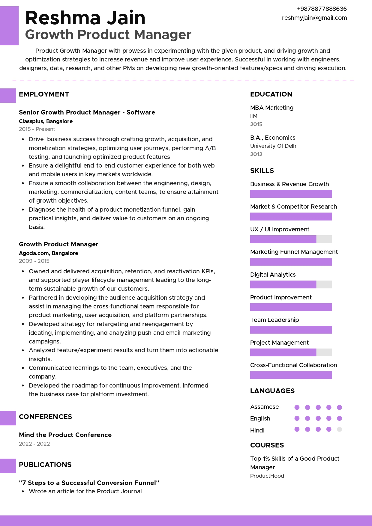
Check the full resume of growth product manager in text format here
Resume of Front Office Manager
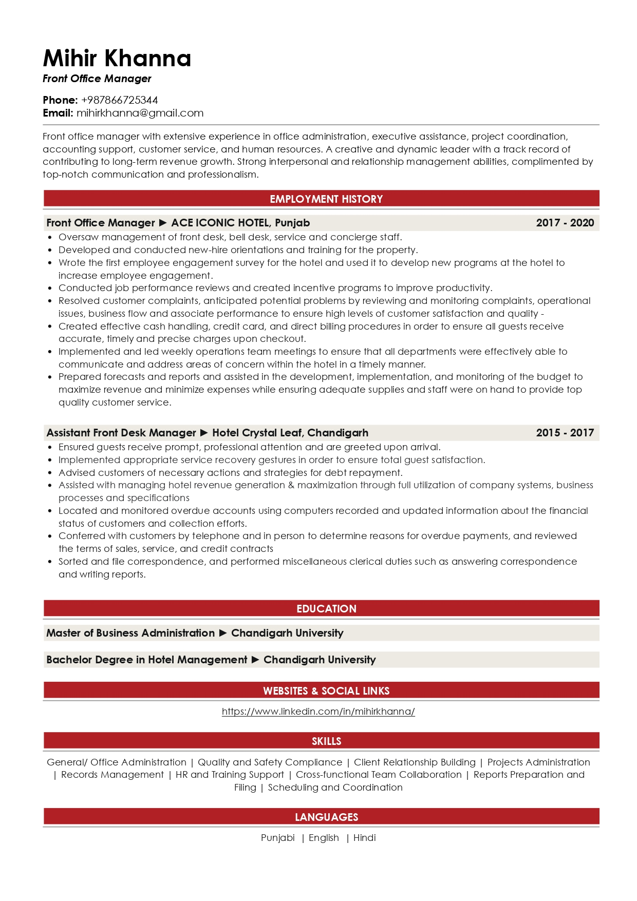
Check the full resume of front office manager in text format here
Resume of Account Director - Advertising
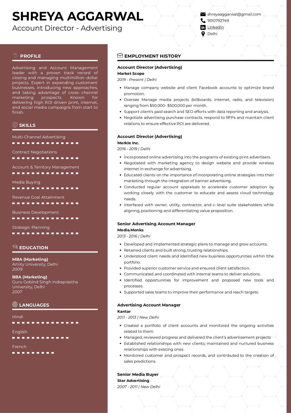
Check the full resume of account director - advertising in text format here
Resume of Nuclear Plant Design Engineer
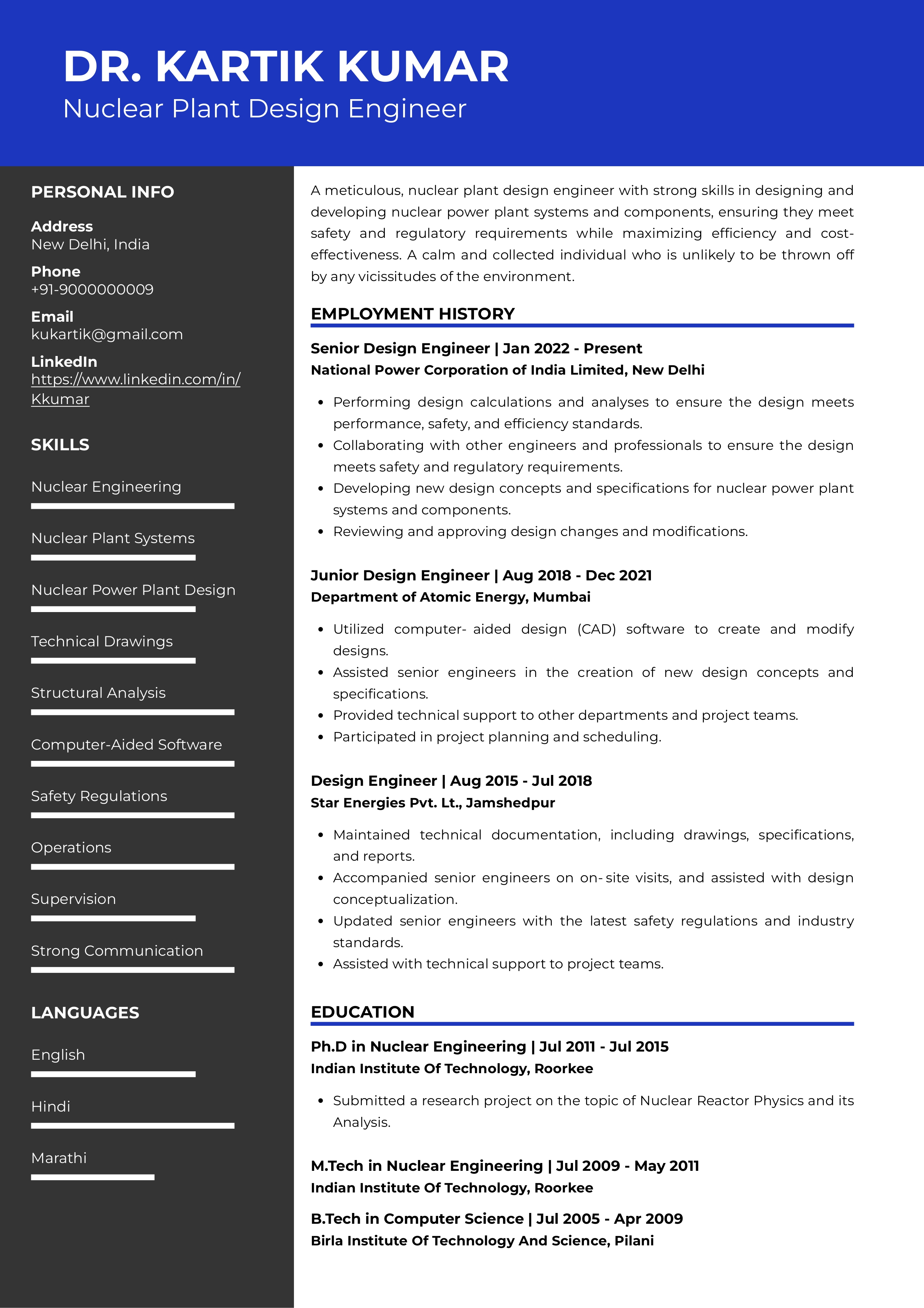
Check the full resume of nuclear plant design engineer in text format here
Resume of Scrum Master
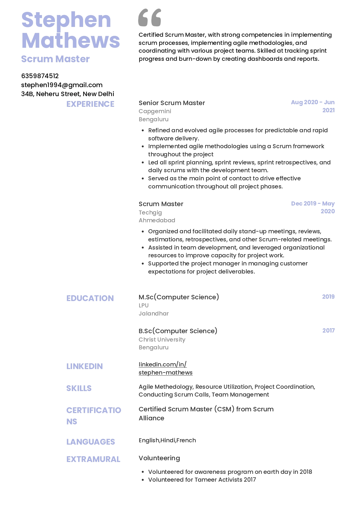
Check the full resume of scrum master in text format here
Resume of Nuclear Power Plant Operator
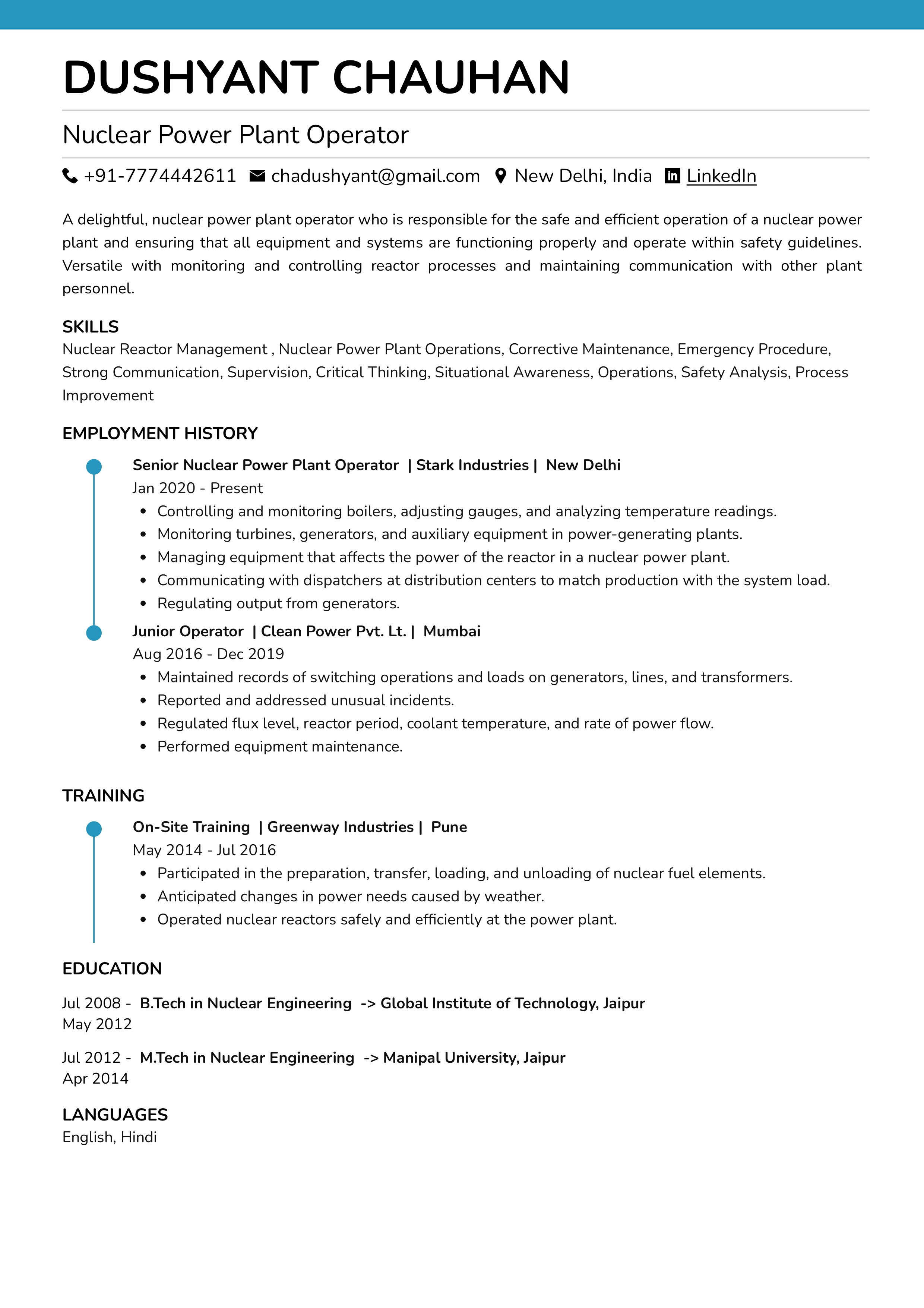
Check the full resume of nuclear power plant operator in text format here
Resume of PR Coordinator
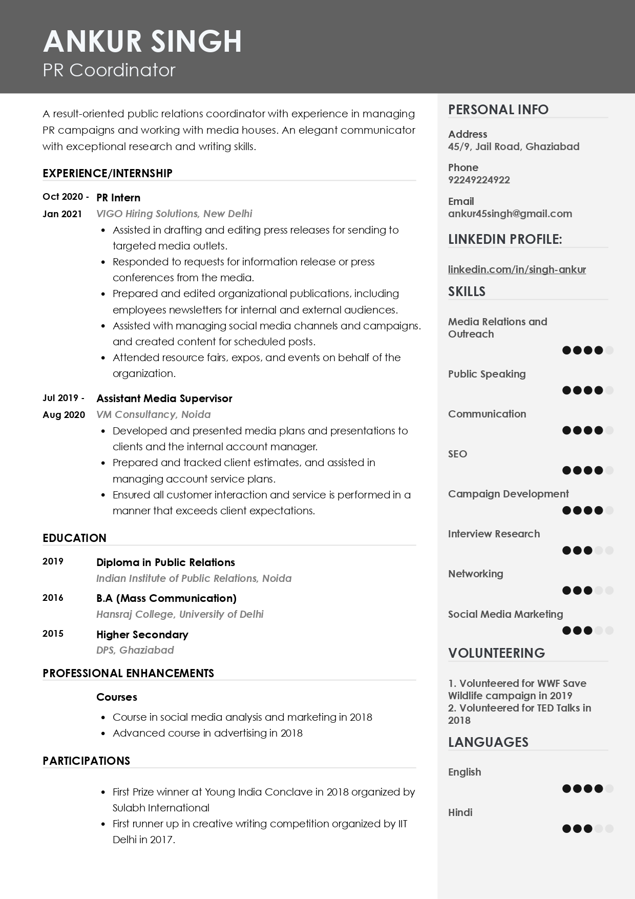
Check the full resume of PR Coordinator in text format here
Resume of English-Spanish Translator
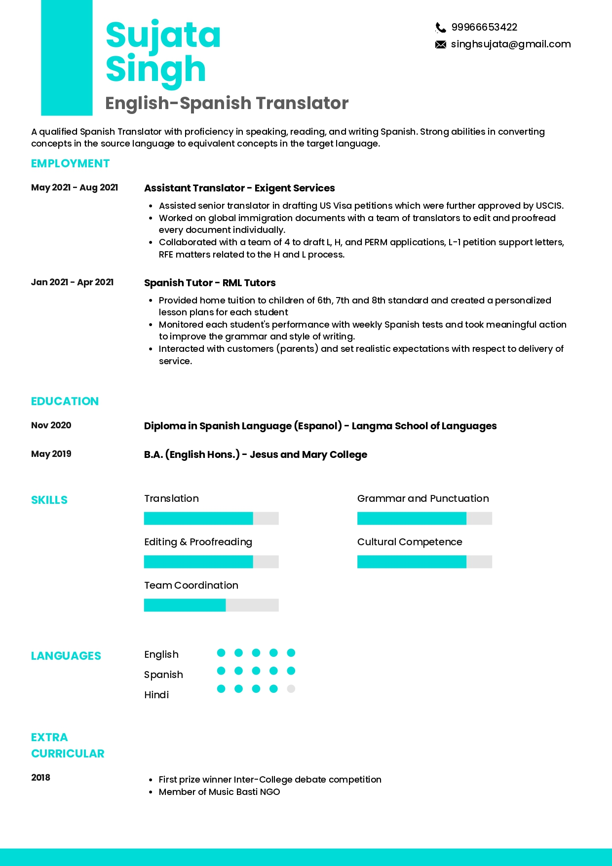
Check the full resume of the English-Spanish Translator in text format here
Resume of Data Mining Engineer
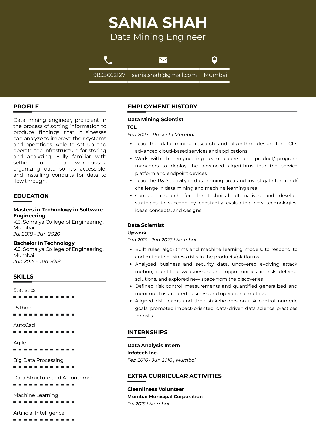
Check the full resume of Data Mining Engineer in text format here
Resume of ETL Developer
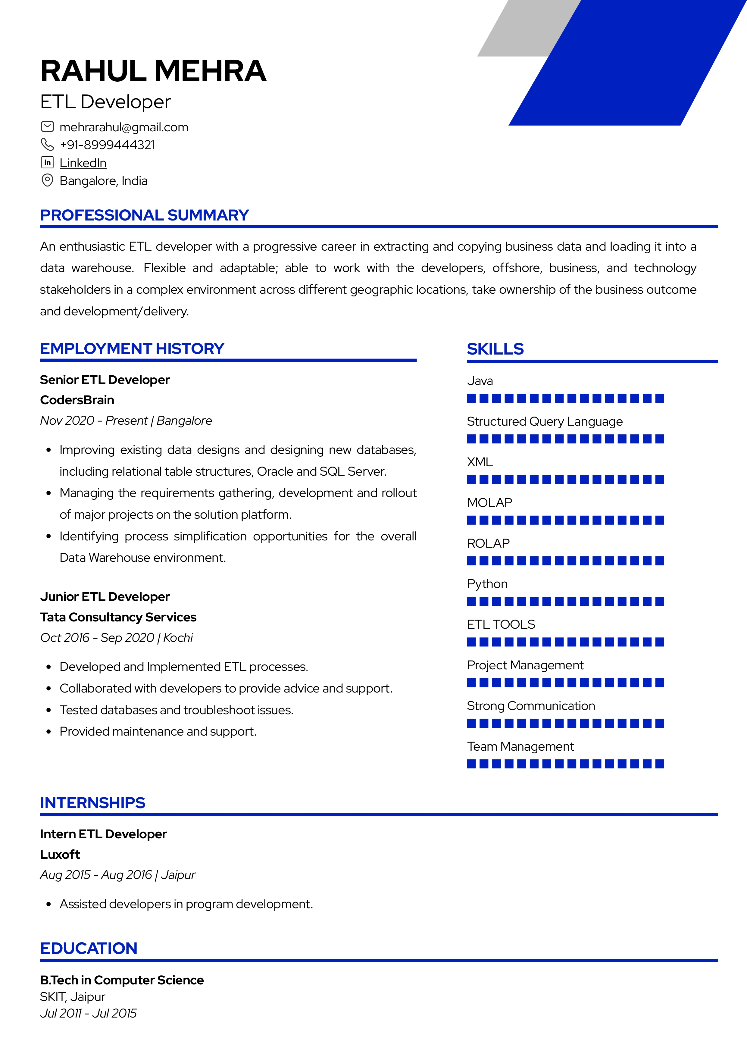
Check the full resume of ETL developer in text format here
Resume of Pharmacovigilance Analyst
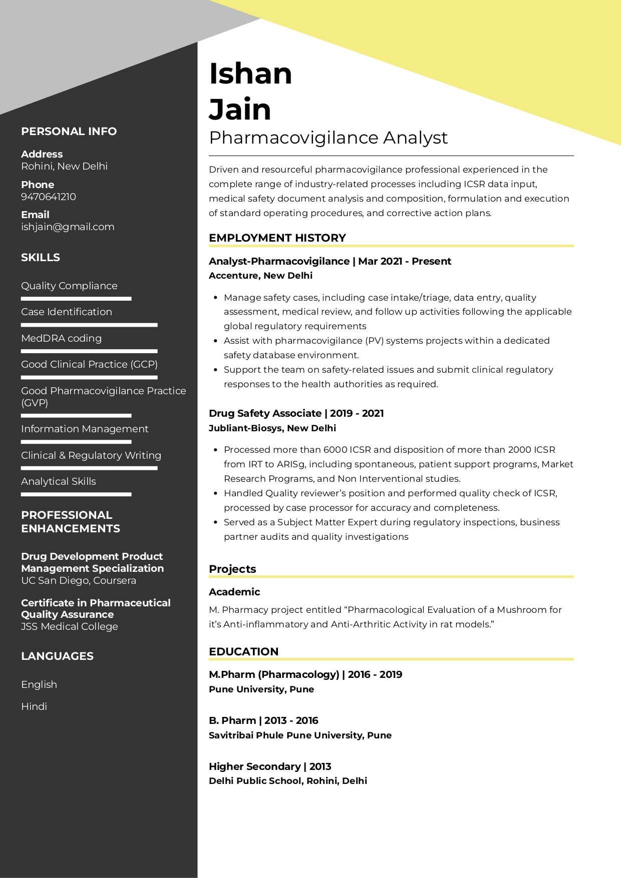
Check the full resume of the pharmacovigilance analyst in text format here
Resume of Music Teacher
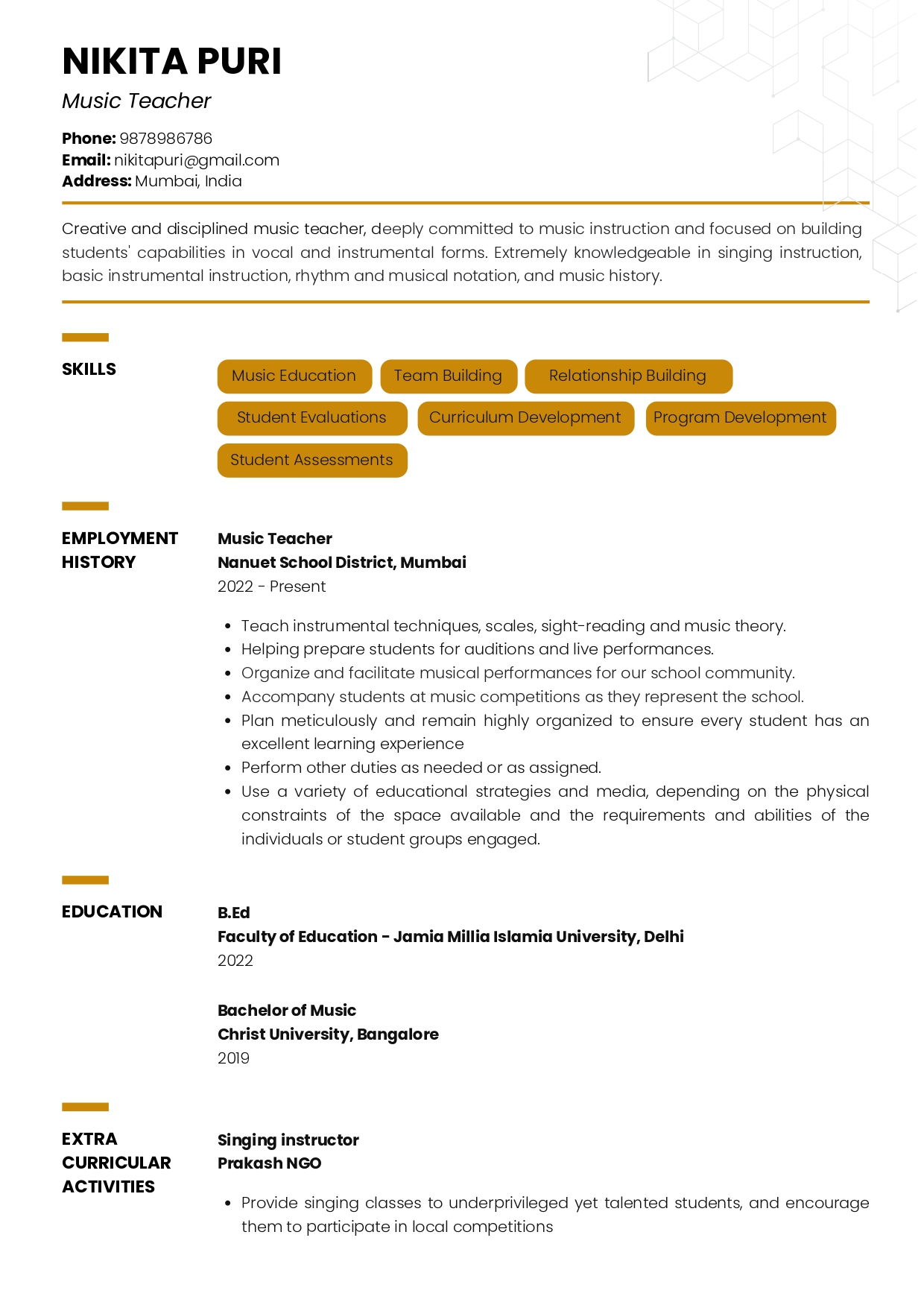
Check the full resume of music teacher in text format here
Resume of Compensation and Benefits Manager
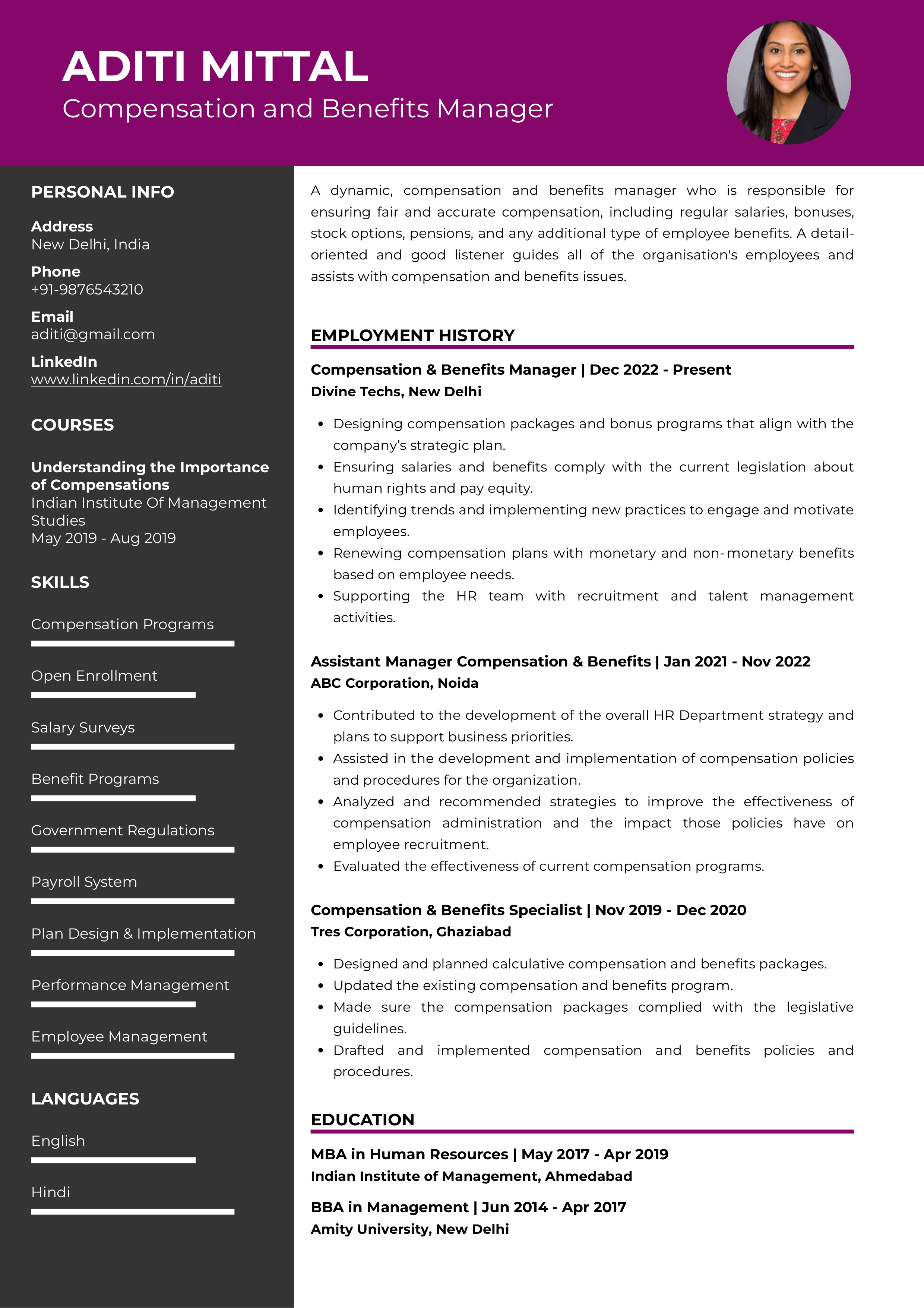
Check the full resume of compensation and benefits manager in text format here
Resume of Inside Sales Executive
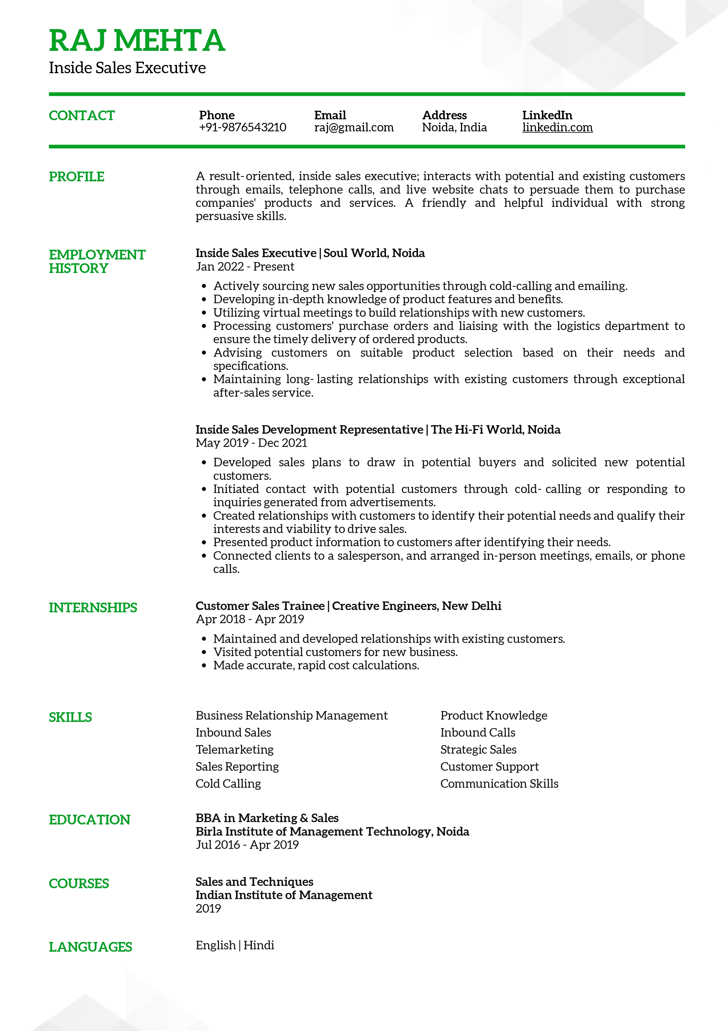
Check the full resume of inside sales executive in text format here
Resume of Cashier
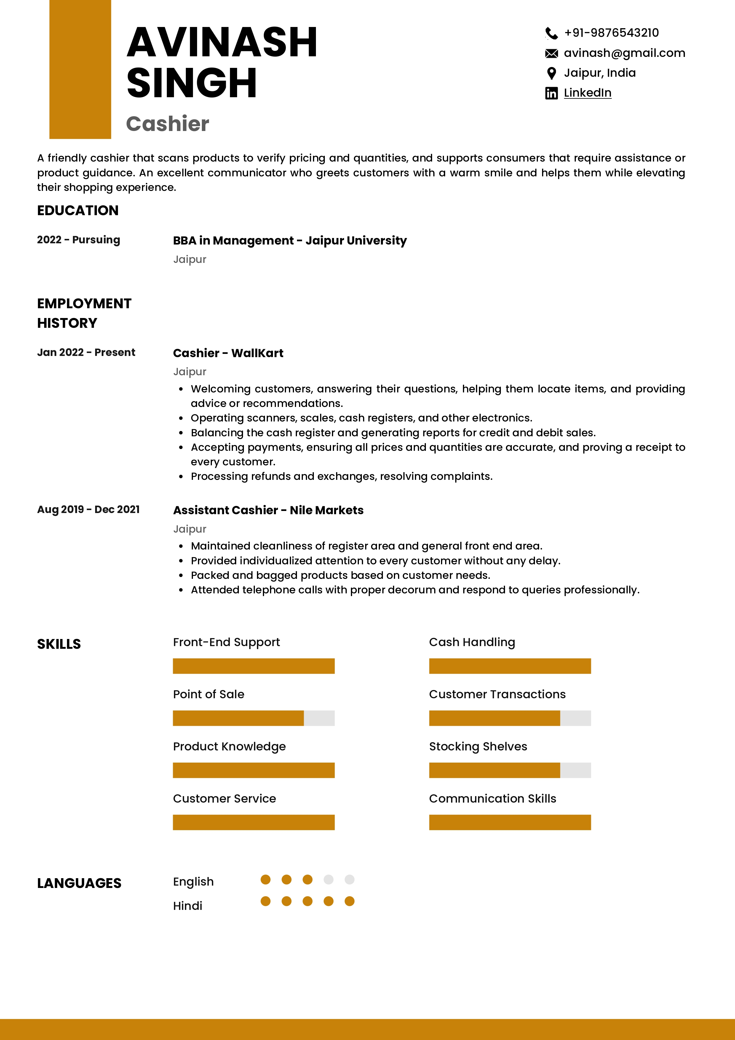
Check the full resume of cashier in text format here
Resume of Google Ads Specialist
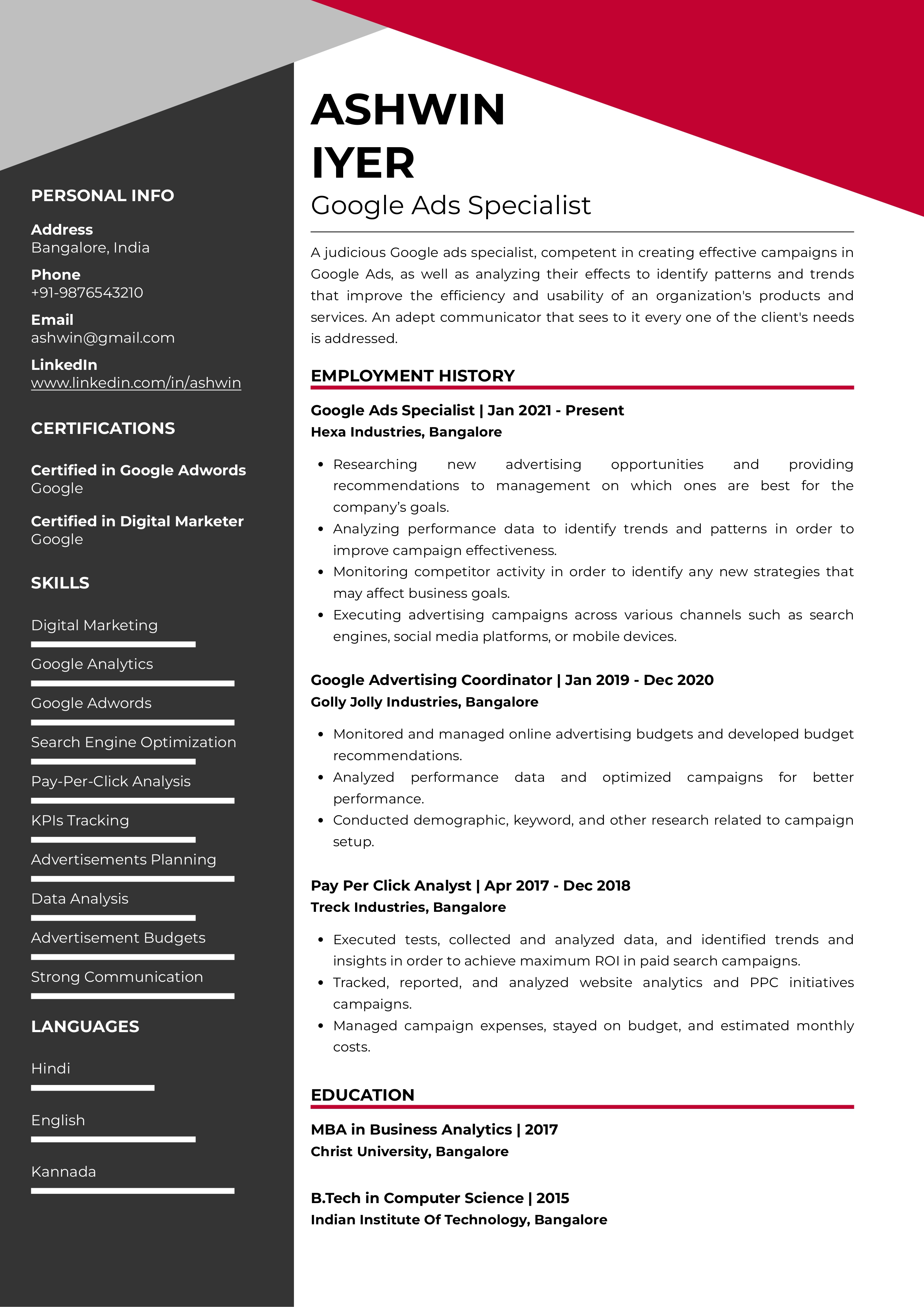
Check the full resume of Google ads specialist in text format here
Conclusion
To summarize, there are multiple fonts these days, but seeking a clear, easy-to-read, and navigable font should be the primary goal. The legible length of the font along with consistency in the font style is necessary to make a professional impression on the recruiter’s mind. Don’t forget to match the CV and cover letter font.
These primary important factors along with proper layout of your CV, are necessary to get the desired result and to help in landing your dream job.

